*****TYPOGRAPHY INSPIRATION AND EXPERIMENTATION
- Get link
- X
- Other Apps
EXAM THEMES
Abstraction
Morris Louis 'Where' 1960
All art is Abstract. It is a sign to something else - a story, a landscape, an event, an idea. Whether the art is two dimensional, sculptural or conceptual it relies on us to use abstract thought to understand it. By the same rule all Art, on some level, is conceptual. An Idea lies behind an Art Work.
Abstract Art can be inspired by things from the real world that are then stylised and simplified (Celtic Art, Art Nouveau). Abstract Art can be Pure Abstraction - only referring to itself and not objects from the real world (Islamic Art, Suprematism, Wassily Kandinsky, Abstract Expressionism)
'We should remember that a picture, before being a war horse, a nude women, or telling some other story, is essentially a flat surface covered with colours arranged in a particular pattern'
Maurice Denis 1890
Sehzade Mosque Istanbul, Turkey - Mimar Sinan 1548
All art is Abstract and Abstract values can be seen in Art that we would not consider to be connected to Abstraction.
Giovanni Bellini - 'Madonna of the Meadow' c1500
The art Critic Matthew Collings has discussed the use of geometric abstract compositions in Renaissance art and modernist abstract art. In this painting Bellini uses geometry to create his composition. He has used a number of triangles to build up the composition.
The Madonna is a large triangle taking up the whole composition.
Within that triangle there are three smaller triangles.
Kazimir Malevich 'Suprematism with Blue Triangle and Black Square' 1915
Malevich's Supremacist painting seemed revolutionary at the time - and it was. It seems to have nothing to do with the past and is a truly new type of art. However, the modernists were very interested in the art of the pasts use of geometry.
"It is the olds use of pure geometry that the new is very interested in."-
"a visual tradition for future artist to draw on"
Collings
Figurative art is held together by abstract values and abstract art uses traditional ideas.
Paul Cezanne 'Still life with plaster cupid' 1895
Pablo Picasso 'Les Demoiselles d'Avignon' 1907
Humans have always stylised and abstracted images. However, Western Art has been dominated by figurative Art and the pursuit of realism. Modernism moved away from the figurative and the 20th Century was dominated by abstraction and questioning what Art is and what it could be.
There are numerous reasons for this transition but there are two key influences. The first reason is connected to the invention of photography and its influence on the way Artists created images (read here for an in-depth look at Photography's influence on Modern Art). The second reason (which is connected to the first) is Picasso's Cubists paintings (influenced by Cezanne) and the influence these approaches had on Modern Art (read here for a study of Cubism).
The Modernist Artists of the 20th Century continued to push the limits of Art.
Henri Matisse left to right 'The Back I' 1908-1909, 'The Back II' 1913, 'The Back III' 1916, 'The Back IV' 1931 Bronze
"I sculpted as a painter, I did not sculpt like a sculptor. Sculpture does not say what painting says."
For over 20 years Henri Matisse, primarily known as a painter, returned to the same subject of a female back. However, each time the form was simplified. Even though the figure is made from Bronze Matisse is still working like a Painter. The work is more of a relief than a sculpture - with the figure emerging from the rock. In the first sculpture, from 1908/09, we can see the curves and contours of the figure and we get the sense of a physical human form in front of us. Five years later we can still see the figure clearly but the curved lines are becoming more straight and harsh. There is a more dramatic shift when Matisse approaches the sculpture for a third time. The spine, a subtle line on his initial sculpture, becomes a bold central line that holds the figure together. It has been combined with the head and hair from the original form to become a dominating presence. By the final sculpture the form has been reduced to almost an abstract state while retaining a quality of a child's drawing. In fact it the last sculpture has the same qualities as Matisse's late work - his Cut Outs.
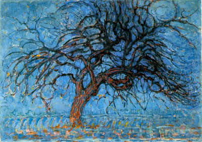
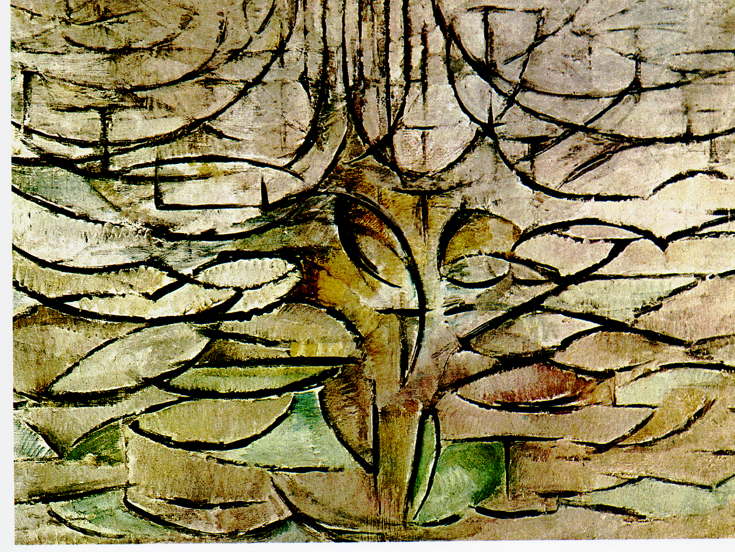
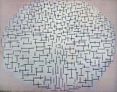
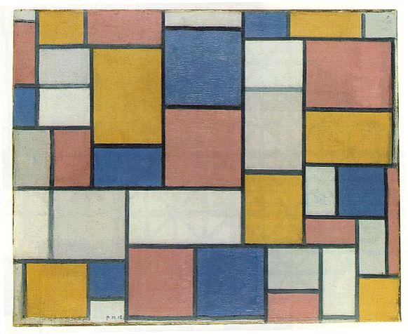
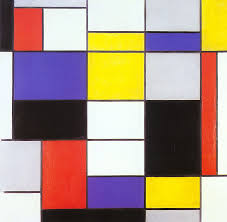
The Modernist painter Piet Mondrian broke painting down into its basic components - vertical lines, horizontal lines, black, white and the primary colours. His mature paintings are full of Golden Rectangles and they have no reference to the world - the natural conclusion to this is a pure white painting.
1908
1913
1918
1923
However, Mondrian's development to this high modernist style did start with paintings of actual things from the real world. When Mondrain saw the work of the Cubist's in Paris 1911 he style began to change.
Trees were a continuous theme in Mondrian's work between 1900 to 1914. He initially began with landscapes but gradually focused on single trees. The branches became solid lines that divided the empty space (sky). The images became more abstract with simplified planes, lines and colours. The tree becomes an almost skeleton for the paintings that helped organise the space within the composition.
Theo van Doesburg's studies for his Great Pastoral Scene and his colour draft for the Small Pastoral scene in Drachten shows the artists process of abstraction. The changing figure of The Sower shows, step by step, van Doesburg's process of rendering the figure into geometric shapes. The figure was based on van Gogh's famous painting 'The Sower', itself based on a painting by Millet. The initial sketches show van Doesburg stylising the figure and gradually decomposing it into individual planes. He uses triangles and rectangles to structure his design.
Theo van Doesburg 'Aesthetically Transformed Subject' 1917
Theo van Doesburg, the founder of De Stijl, also simplified images into stylised abstracted compositions.
Vincent van Gogh 'The Sower' (after Millet) 1889
Theo van Doesburg - Study for The Sower
Theo van Doesburg Stained Glass Window in Drachten
photographic equivalent - nagy, man ray
Pure Abstraction
Typography - A Brief History of 20th Century Type
Eckmann Schmuck Typeface designed by Otto Eckmann c 1900
http://doublemesh.com/tutorials/30-fantastic-photoshop-text-effect-tutorials/
Look at this number 7. Seven is a number - a bit of information. However, this little seven is soft and curly. It has an organic quality - it's swaying. I don't just think of the number seven. I think of Art Nouveau, Natural forms, maybe I am in Vienna, Old Europe, another world, another time - maybe the start of the 20th century. Blimey - it's only a number 7.
Letters have personality. They can be soft, strong, harsh, friendly, quiet or loud. Words are often given expression before we have read the word.
Edward Johnson - Underground Sign 1915
Where are we now? London, there's a war on and the 20th century has definitely started. Edward Johnson's iconic London Underground roundel and font are based on Classical Roman Proportions (with the letter 'O' being a perfect circle) yet seem a lot more 'modern' than Eckmann's. This simple sans serif font is easy to recognize and read. When you are in a rush, or speeding past a sign, you need the font to be simple. It was so successful it is still used today.
'Underground' is still used by designers to suggest London in the 20th century. Its simple, yet classic, quality suggest austerity and a certain period in British history. Mid twentieth century photographs are combined with the font on this album cover of Highlife and Jazzcompilation to give a sense of an era and place.
Herbert Bayer - 'Universal' 1925
It is 1925 in Germany and the first world war is over. At the BauhausHerbert Bayer designs the 'Universal' font and this is an example of pure modernism.
In Otto Eckmann's 'Eckmann Schmuck' Typeface (shown at the start) we can see the difference between a Serif Face and a Sans Serif Face.
A serif face is flambouyant and has terminal strokes - a little flick. They seem closer to handwriting and therefore more old fashioned.
A sans serif typeface does not have terminal strokes - it is no nonsense, simple bold and modern. Herbert Bayer and the Bauhaus designers felt the flicks of Serifs were looking backwards - Bayer's 'Universal' font was looking towards the future. It was Modern.
Herbert Bayer 'Design for Cinema' 1924-1925
Joost Scmidt - Bauhaus Journal 'Offset' 1926
Bayer's simple, geometric typeface did not use capital letters. It was used in the Bauhaus publication 'Offset'. In this example above we can see the bold modern look - a combination of design and typography.
'Contruction de la lettre G' from the Imprimerie Royale, Paris 1716
The shapes had been designed around circles and parallel lines and set against a background grid. The use of geometric has been used to design many typefaces.
Eric Gill's 'Gill Sans' used geometry - and it is especially evident in the lower case 'g'. Circles and arches combine to make a beautifully simple font. The font has a modernist look and is similar to Paul Renner's - 'Futura' (read article here). However, it is slightly more fluid - making it easier to read.
Penguin book covers using Gill's 'Gill Sans'
Eric Gill was a sculptor, type designer and letter cutter who trained under Edward Johnston (see above) and also created the type face 'Pepetua'. You can sketch out your own fonts and turn them into usable fonts with Font Capture here.
Neville Brody - Typeface Six 1986
This is an example of Typeface Six designed by Neville Brody (see The typefaces of Neville Brody here). Neville Brody came to prominence as the art editor of the British music and style magazine 'The Face' during the 1980's.
Brody created layouts that combined photography, art and typography to create a look that would define the 1980's. As well as being of its time Brody's style was influenced by modernist design (particularly early 20th century Russian artist's like Alexanda Rodchenko).
Brody was one of the key designers who took advantage of technological advances to break away and reinvent traditional print setting. Brody often used a computer to design his various typefaces - the letter forms themselves used as a dramatic part of the composition. It is the 1980's and Brody's freedom to mix images and text hints at an approach that will be used by website designers a decade later.
Typography - Inspiration and Experimentation
Rene Magritte 'The Treachery of images (Ceci n'est pas une pipe)' 1928-29
Words are all around us. They are everywhere we look. We probably do not stop to consider how they influence us. In the painting above Rene Magritte has painted an image of a pipe and underneath it, in French, he has written 'This is not a pipe'. At first this seems ridiculous as it is clearly a pipe. However, there is no pipe there, only paint smeared on a canvas creating the illusion or representation of a pipe. Magritte is write - this is not a pipe and he has used words and images to play a game with us.
'Signs, New York' 1928–30 Walker Evans
We are surrounded by Type and we encounter it every minute of every day - almost everywhere we look. Type is on the keyboard I am typing on, on the computer screen you are viewing now, on books we read, on adverts - telling us what to buy, instructions and information signs - telling us what to do, on street signs - telling us where to go, graffiti ... the list goes on and on.
A section from Peter Blake's Alphabet (after Walker Evan) 2003
The British Pop artist Peter Blake created a whole alphabet by taking close up shots of street signs. Blake was inspired by the American photographer Walker Evans who, after a life of black and white photography, used a cheap colour Polaroid camera to photograph the every day and mundane. Blake, like many artists, has several collections. Like a magpie he collects anything that captures his eye. Blake's collection was shown at the Museum of Everything #3 in an old warehouse. Here he has simply collected all the fonts found around him.
Ed Fella - 'Letters on America'
In his book 'Letters on America' Ed Fella explores the folk typography found on his travels. This simple task results in a rich body of work and a great resource for typography designers.
Still from William Klein's - 'Broadway by Light' 1958
stills from William Klein's 'Broadway by Light' 1958
These still images from William Klein's mediative study of New Yorks Times Square is a 12 minute expressionistic film (watch it here). It focusses on iconic advertising - especially the neon typography and bold colours.
Alan Fletcher - Detail of a Pirelli poster for a double Decker Bus 1961
Images of found type by Robert Brownjohn from 'Street Level' 1961 in 'Typographica' design magazine.
Ideas are all around us - and ideas for typography can be found on our own door steps. These images show how ephemeral and vernacular signs can inspire graphic design. The collection of images above show how type can become distorted - on an umbrella, on an old sack, painted onto shutters or behind distorted glass. This distortion can then be used in a new type design - for example the 'Pepsi Cola World' advert above or Alan Fletcher's Pirelli poster.
All these images come from an article in 'Typographica' (1949 - 1967) - a pioneering graphic design magazine edited by Herbert Spencer (the name Typographica is now used by a website about typography - typographica.org). Spencer used layout and images to tell a story or make an argument, creating photo essays by combining type and images.In addition to this photography was key to much of the graphic design produced. This particular article was based on photographs taken by Robert Brownjohn that he then compared to typography designed by his colleagues.
Poster by Alan Fletcher
Jumbled wonky wooden letters raised on stilts are transformed into a dynamic moving poster design.
Fonts seen through glass becomes a distorted vibrant font.
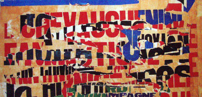
Tarmac over a road sign provides inspiration for a broken font.
Alan Fletcher
A weather decayed painted sign reveals an older sign. This jumbling of letters can be seen in the two type design above. Different fonts merge together combined with the dramatic contrast between black and white.
These images and the alphabet by Blake show that photography can be used to document ideas for typography projects. All that is needed is a keen eye and an open mind.
We can see this process in action - a modern typographer taking inspiration from the built environment. The Vector Lab has documented their evolution of the design on a you tube video. The photograph above provided the inspiration for the typographers initial sketch.
The sketch was then scanned into Illustrator and used as the basis of the design.
The design was then printed out on a ink jet printer.
This allowed water to be added and then the design was worked into with pencil, then scanned back into Illustrator.
The final design combines digital technology with more a more traditional approach. You can watch the whole process here. The flowing letter forms are reminiscent of the ornate lettering designs on late 19th century/early 20th century insurance maps.
These ornate letterforms were taken from title pages and headings from Sanborn Fire Insurance Maps issued between 1880 and 1920 (see more here).
In this Classic typography exercise, students interpret the meaning of a word by adjusting the spacing, scale, and position of letters on a page (for more information go here).
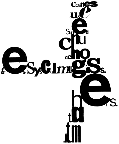
The musician John Cage also created poetry and art using elements such as chance. His images often have the fluidity of a piece of music – giving visual form to sound. Cage’s ‘Mesostics’ are his chance experiments with writing creating visually striking graphic texts.
Create your own drawings out of fonts here or whole words here. This could also be done with photocopied text and glue.
Paul Elliman 'My Typographies (2)' 1994 (read an interview here)
Paul Elliman 'Found Fonts' - section of MOMA exhibition "Ecstatic Alphabets/Heaps of Language"
Found object - from cardboard boxes to ambiguous pieces of plastic trash, inspire the typography of Paul Elliman. He displayed some of his inspirations at the MOMA exhibition 'Ecstatic Alphabets/Heaps of Language'.
Paul Elliman
In this sequence of images above we can see Elliman's collection of found objects (or Found Fonts) along with an alphabet and font designed using this technique.
In this sequence of images we can see how David Buckingham reuses old metal to constructs his work. This piece is from a series where Buckingham quotes from cinema - giving physical solid form to words. http://www.body-pixel.com/2010/01/05/human-body-and-typography-gallery/
Anthony Burrill
Anthony Burrill uses the Letterpress protest to create his bold graphic posters base around slogans.
Bob and Roberta Smith
Bob & Roberta Smith 'Great Artist' 1999
Bob and Roberta Smith 'I believe in Joseph Mallard William Turner' 1998
Ed Ruscha
Ideas for typography can be taken from anywhere - we are surrounded by type. Anything, anywhere has the potential to start a piece of design or influence an artwork. Old shop signs, hand painted signs, trash, objects, collage.....they can all be potential starting points.
Ideas for typography can be taken from anywhere - we are surrounded by type. Anything, anywhere has the potential to start a piece of design or influence an artwork. Old shop signs, hand painted signs, trash, objects, collage.....they can all be potential starting points.
- Get link
- X
- Other Apps










Comments
Post a Comment